Showing posts with label Calligraphy and Penmanship. Show all posts
Showing posts with label Calligraphy and Penmanship. Show all posts
Saturday, May 16, 2015
Thursday, October 23, 2014
Ornamental Penmanship
Promoting the Art of Ornamental Penmanship.
Script Lessons Online.
Beautiful site with copy pages and exemplars.
Script Lessons Online.
Beautiful site with copy pages and exemplars.
Thursday, May 13, 2010
Saturday, August 23, 2008
Calligraphy
For those of us who think letterforms are art.
See this post on BibliOdyssey.

Thanks peacay, I am in love with your mind.
See this post on BibliOdyssey.

Thanks peacay, I am in love with your mind.
Sunday, January 15, 2006
Penmanship
My own penmanship is terrible but I do admire it as art.
The online library of Rare Books on Calligraphy and Penmanship
hosted by The International Association of Master Penmen,Engrossers and Teachers of Handwriting.
"These books are no longer in print. Preserved in digital format, we offer them here in their entirety for current and future generations of calligraphers, penmen and pen artists. Enjoy."
Note: I wrote to thank them for maintaining this wonderful collection and this is the reply:
"Thanks for letting us know! We seldom hear from people about whether they like it or not, so I appreciate you writing!"

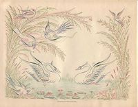
This image is in Real Pen Work Self-Instructor in Penmanship, Knowles and Maxim 1881
I found this through BibliOdyssey as recommended by Patricia.
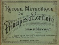
Then Patricia scanned an entire French penmanship book that she is sharing on Grenouille Plus

The online library of Rare Books on Calligraphy and Penmanship
hosted by The International Association of Master Penmen,Engrossers and Teachers of Handwriting.
"These books are no longer in print. Preserved in digital format, we offer them here in their entirety for current and future generations of calligraphers, penmen and pen artists. Enjoy."
Note: I wrote to thank them for maintaining this wonderful collection and this is the reply:
"Thanks for letting us know! We seldom hear from people about whether they like it or not, so I appreciate you writing!"

This image is in Real Pen Work Self-Instructor in Penmanship, Knowles and Maxim 1881
I found this through BibliOdyssey as recommended by Patricia.
Then Patricia scanned an entire French penmanship book that she is sharing on Grenouille Plus

Friday, January 14, 2005
Thursday, October 21, 2004
The Pens Excellencie
English handwriting 1500-1700
an online course

I used Simple Edition. This edition supplies straightforward jpeg issues of each page of the book in two sizes: 1000-pixel width ('screenshots', if you have your monitor resolution configured to 1024 by 768), and much larger. A navigation menu beneath the images will allow you to toggle between smaller images and enlargements (to zoom, click on the + sign).
an online course
I used Simple Edition. This edition supplies straightforward jpeg issues of each page of the book in two sizes: 1000-pixel width ('screenshots', if you have your monitor resolution configured to 1024 by 768), and much larger. A navigation menu beneath the images will allow you to toggle between smaller images and enlargements (to zoom, click on the + sign).
Sunday, August 29, 2004
Exquisite Handwriting
La Operina is a slim volume of 32 pages. It teaches italic handwriting and is still essential reading. It shows great handwriting on every page. It is more than a set of model sheets, however. It describes Arrighi’s underlying forms and two basic entry movements. It covers the spacing of lines, words and letters. It deals with slant and joins.

Click on the words "The book"

Click on the words "The book"
Tuesday, August 17, 2004
Typefaces
From ArtSearch again. A collection of antique typefaces from their manuscripts. These two actually made me gasp.
Torniello
From Francesco Torniello's treatise "L'Alfabeto" of 1517

Amphiarea
Vespasiano Amphiarea, "Opera ... nelle quale s'insegna a scrivere...", Venice 1572.
Woodcuts. The horizontal lines help copying, and also emphasize that the letter-height is eight times the diameter of the main lines.

Thumbnails on the website all lead to larger images of each letter.
Torniello
From Francesco Torniello's treatise "L'Alfabeto" of 1517

Amphiarea
Vespasiano Amphiarea, "Opera ... nelle quale s'insegna a scrivere...", Venice 1572.
Woodcuts. The horizontal lines help copying, and also emphasize that the letter-height is eight times the diameter of the main lines.

Thumbnails on the website all lead to larger images of each letter.
Subscribe to:
Posts (Atom)


